Final Reflection
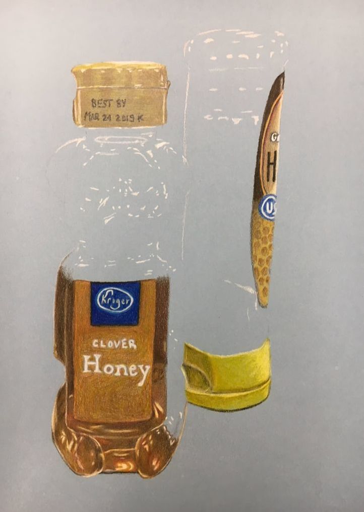
I took Art 1 as a sophomore, so when I walked into drawing this semester, it was essentially with a blank slate. I didn't really remember any activities or techniques from my previous art class, so I was excited to get back into art this year. As soon as we started our first unit, I realized just how great some of the artists in our class were. Art 1 had a very different level of dedication, and in drawing, I felt a little self conscious. When we started up our blog posts, I always felt disappointed in my work when I looked at other classmates' websites. Fortunately, Mrs. Rossi encouraged me to try new ideas and supported me in all of my art endeavors. When we would finish a unit and have class critiques, I always felt better about my art, even if I got suggestions on how to improve it. I began to be more confident in my abilities, and I started to put more effort and spend more time on my projects. My favorite unit was the opacity one where I worked hard to draw two bottles of honey. I love the way that piece turned out and I'm so glad I had the opportunity to work a long time on it. I liked that Mrs. Rossi let us talk within our tables most of the time because I made many friendships that way. The class did have a schedule, but it also felt somewhat relaxed. I loved that everyone was friendly with each other and I'm very satisfied with how my drawing semester turned out.
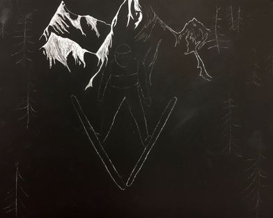
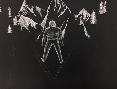
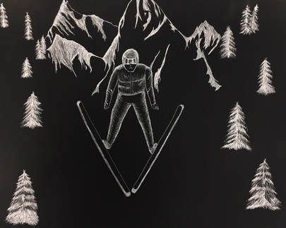
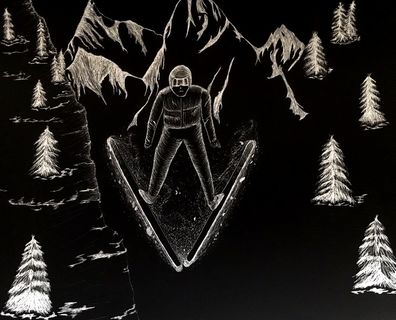
Scratchboard Project
|
|
|
|
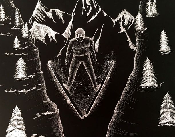
1. Describe the subject matter and meaning of your artwork.
The subject of my work is the person skiing, who is flying through two snowy slopes. With a mountain range behind him, and a very narrow jump, my artwork shows a danger and a thrill.
2. How did you use textures to enhance your picture?
I worked hard to use line in showing the roughness of the mountain rangers. The bright, scraped lines show the direction of the snowy peaks. I used very thin lines for the trees to give the branches that scraggly look. Unfortunately, I didn't do the texture of the slopes very well. I used too many rough lines that didn't give the appearance of a smooth, snowy slope. I wish I had practiced more before I scratched with that method. Lastly, I used tiny dots to create a cloudy texture of flying snow behind the skier.
3. How did you balance your artwork and create a well-organized composition?
My artwork is very balanced and symmetrical. By centering my skier, your eyes are drawn to the subject immediately. It's organized into a simple foreground and background. The distant mountains make it easy to see depth, and the larger trees show the slope moving towards your eye.
4. How did you imply movement in your drawing?
The main way I showed movement in my drawing was through the snow behind the skier. I looked at multiple photos of jumps and how the snow looks in the air. I noticed it looks a lot like wispy clouds, with some chunks of snow here and there. I tried to capture that movement by dotting with my exacto knife in curving patterns.
5. How could you improve your artwork?
The only aspects of my drawing I despise are the two snowy slopes on the left and right side. I tried to use rugged lines to show shadows from the trees onto the snow, but instead it turned out looking like the slope was a wave on the ocean or something. I didn't capture the smooth texture of the hill, and if I could redo those slopes again, I would use only light, curvy lines to show texture and depth.
6. How did you demonstrate a wide range of shading values?
I used very bright whites on the mountain peaks to show where the snow was located. On the skier's outfit, I used a lesser value of shading to show where the edge of the suit was highlighted, and where the rest was stuck in shadow. With the trees I tried to make the tops of each branch a brighter white to show where the snow sat.
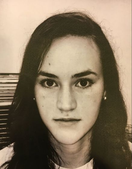
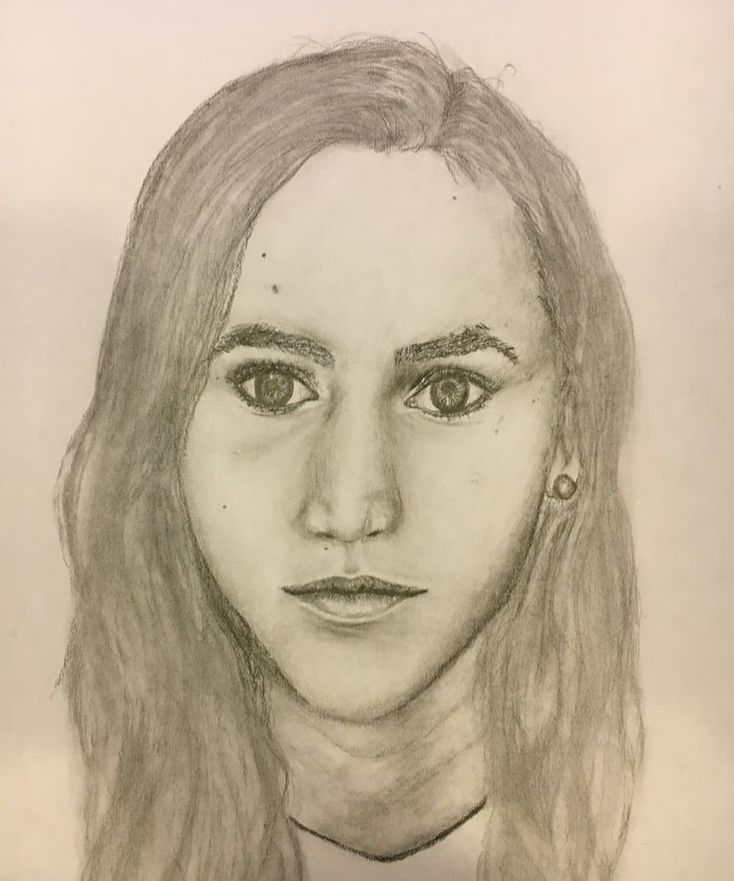
Self Portrait Final
|
|
1. Explain the process you went through to develop your drawing.
With all the practice exercises we had in class, I was very familiar with the layout of the face and how to achieve an accurate look. I first sized up my paper and determined where to sketch out my eyes, nose, and lips by measuring the features on my printed photo. After lightly sketching the placement of my features I was able to start defining my pupils and irises. I started with my eyes and eyebrows and then moved on to shading in the nose. By moving down the face, I didn't smudge the graphite as much as I could've. The last thing I added to my portrait was my hair.
2. Explain how you found the different values in the portrait?
I decided to print out my photo in black and white to make it easier to identify shadows and highlights. I was able to easily follow the shadows around my nose, lips, and eyes because of the filter. I was also able to pick up on subtle shadows and highlights that coincided with my bone structure. Under my eyebrows there are darker values and around the bridge of my nose and my cheeks there are lighter values.
3. Did you achieve a full range of the different values within your portrait? How?
I started shading with light pressure and then slowly built up values in shadowed areas. I used the blending stick a lot during this project to create seamless transitions from all the different values on my face. If you look at my piece, you can see the darker values around my eyes and in the cracks of my lips. The lighter values are incorporated on the bridge of my nose, my cheeks, and my chin.
4. Describe your craftsmanship. Is the artwork executed and crafted neatly?
As I drew my self portrait, I tried to be aware of where my hands were, so as not to smudge all the graphite. In dark areas, specifically my eyes, I tried very hard to keep the lines crisp, neat, and not blurred. I think my hair looks too blended and smudged. I should've incorporated darker, crisper lines to create a more realistic head of hair. Other than that, my artwork is neatly executed.
5. How were you able to capture your look?
I have very strong features, including a pointed chin, sharp nose and a larger forehead. When I was shading my nose, I had to find a way to show that it was pointy, and not rounded like most noses. I also made sure to include all the freckles on my face.
6. Explain how you made sure you had correct facial feature placement.
I liked using the "eyes" method in measuring out the face. I found that it was an easy way to remember how close features should be together. I always made sure there was one eye size between the two eyes and that there were five eyes all the way across the eye line. After you had the facial features sketched out, you could modify the placements to match your face.
7. Explain the importance of learning how to draw all the features individually.
Learning to draw each of the features was very important in making the whole face look realistic. It would be ridiculous to try and draw a face without first knowing how to successfully draw an eye or the nose. I had never really known how to draw a nose without making it look "cartoony." After learning how to shade the nose though, my portrait looked so much more realistic than before.
8. What part of this unit was the most beneficial and why?
I think the skull drawing was most beneficial to me because it helped me accurately place all my features. I was able to see the bone structure of an average skull, which then helped me to visualize where I draw what. Without seeing the eye sockets of a real face, I always tried to put the eyes too close together, which then messed up the whole spacing of the face.
9. List any obstacles you had to overcome and how you dealt with them.
I had the hardest time drawing my wavy hair. We went over it a little bit in class but I didn't get to practice with it as much as I wanted to. Because I printed my photo in black and white, my hair just seemed like a dark block. I had to look at my original photo to try to find any highlights or shadows. In the end, I think I blended the hairs a little too much with the tissue and I don't think I went dark enough with the graphite. I did, however, use my eraser to create lots of little highlights throughout my hair to give it that body.
Skull Drawing
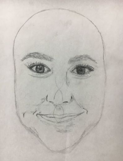
Sketching with the skull in the background helped me space out my features accurately. The eye sockets helped me to determine exactly where my eyes should be placed in correlation to my eyebrows. I was also better able to place my nose and lips because I saw where the teeth were. Even though my eyes are a little crooked, the overall placement of my features matched my own.
Lips
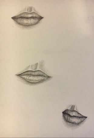
Lips were probably my favorite feature to draw. I thought they were easier because they followed a simple pattern, whereas the nose and eyes were a lot more complex. The partial side view of the lip was very challenging to draw though, and I had to erase and redraw multiple times on that sketch.
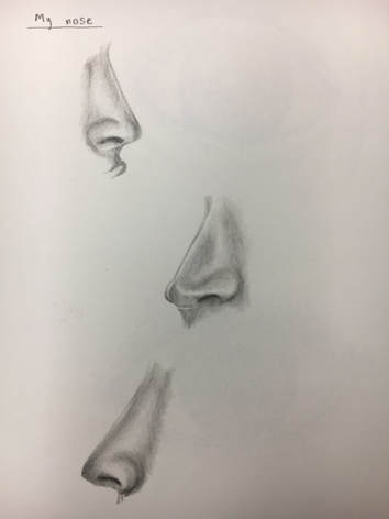
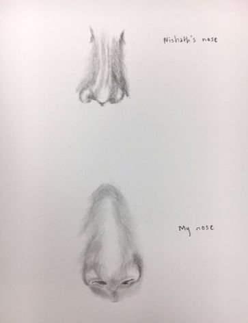
Nose
|
|
The first nose I drew was not well-shaded. The values on Nishath's nose were not blended enough and it looked like she had weird lines down the bridge. As I moved on to draw my own nose, I started with less lines and more shading. This helped to created dimension without awkward dark lines.
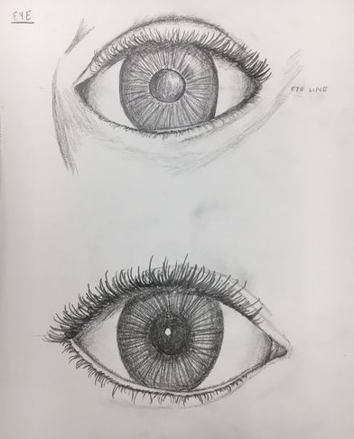
Eyes
|
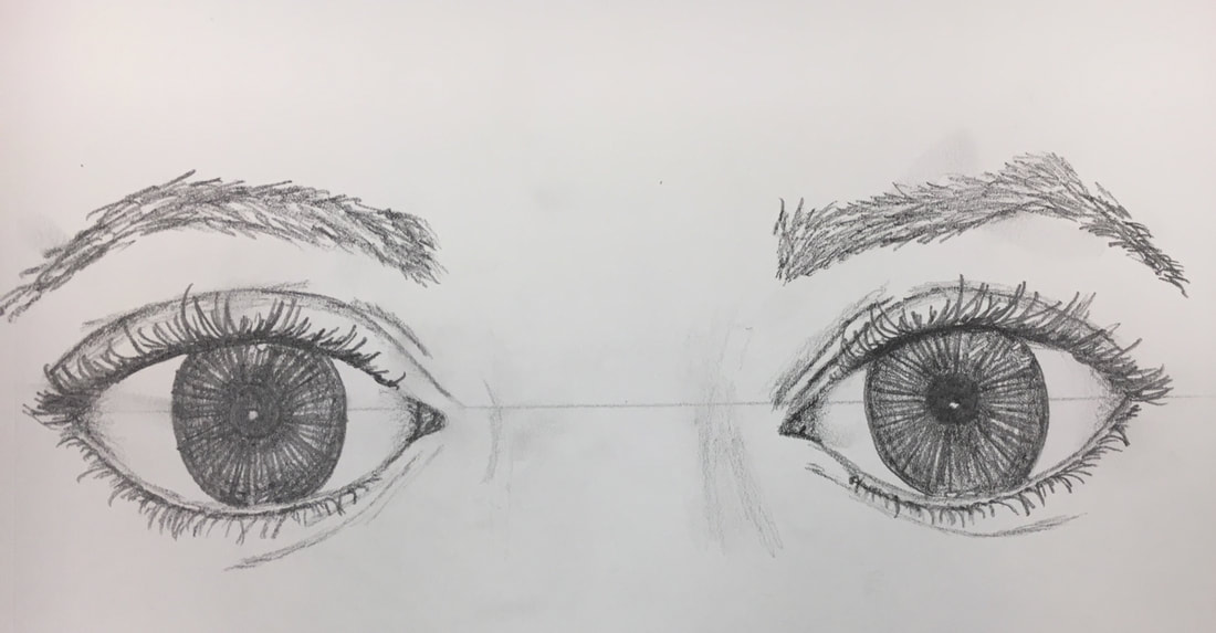
My first picture to the left were two eyes that I practiced, one being a generic eye and the other being my neighbor's. The eye lashes were very hard for me to draw because to me they looked fake or exaggerated. The pair of eyes pictured above were supposed to be my eyes, but I think I drew them a little too wide. It's difficult to create eyes that match your own.
|
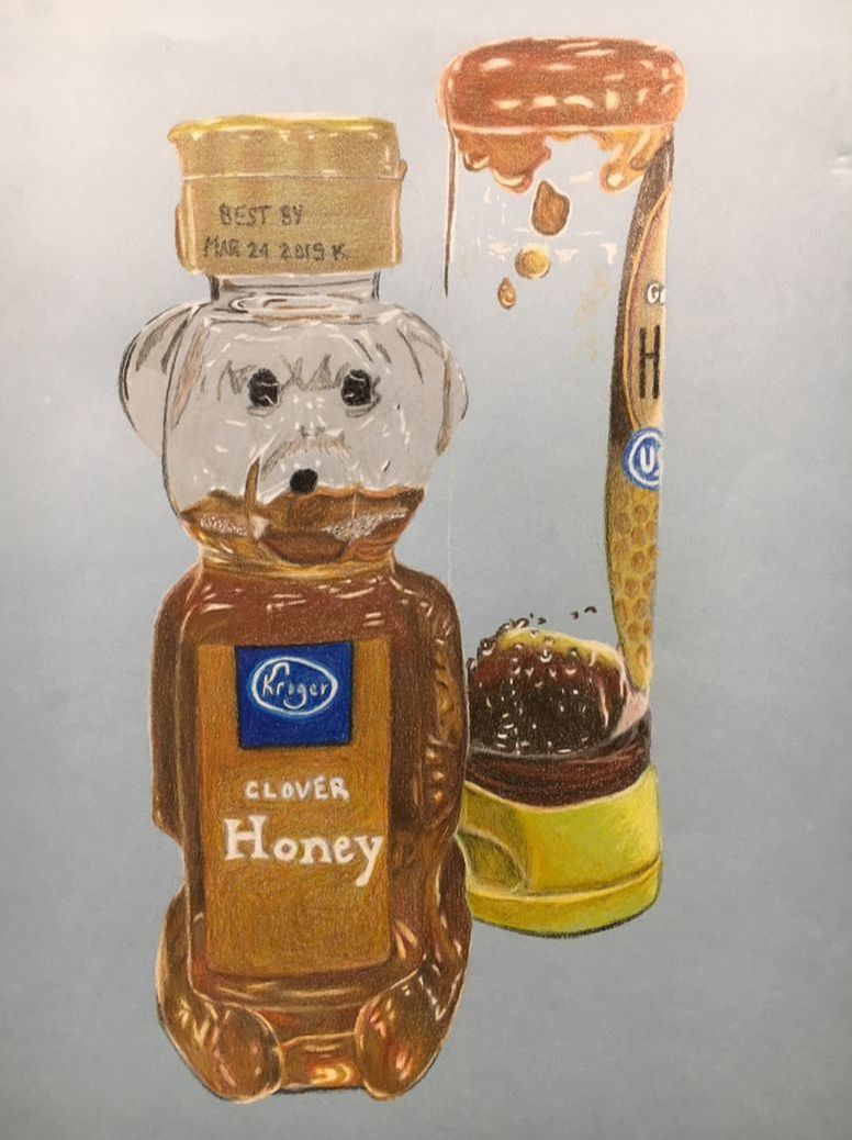
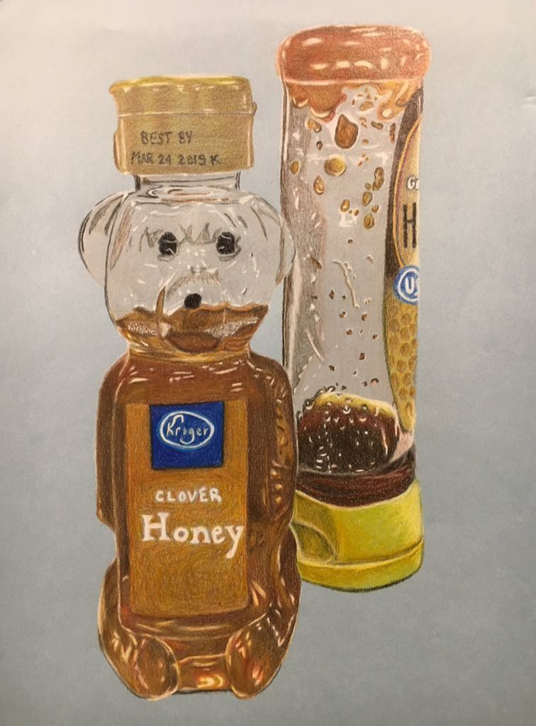
Opacity Project
|
|
|
|
|
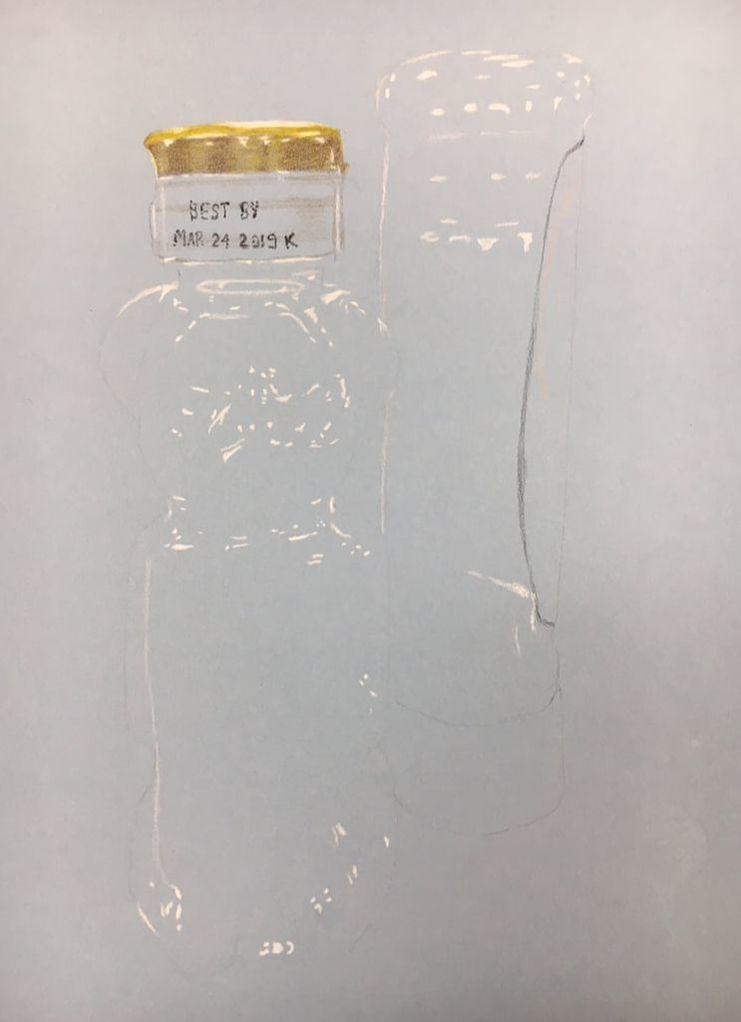
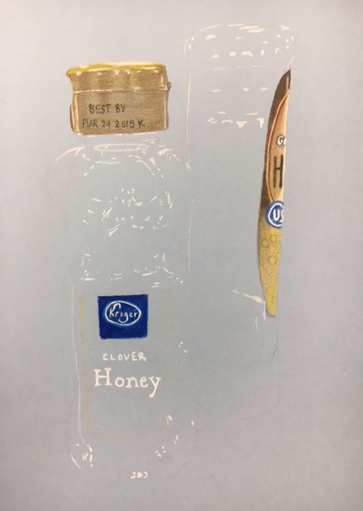
- Describe the craftsmanship of your drawing. (Is it neat and well executed?) As I drew both of the honey containers, I tried to maintain bold outlines for a clean finished product. For example, you can see under the yellow lid of the honey bottle I incorporated a dark shadow, even though in the real picture, there wasn't one. These lines help emphasize where my subjects are placed and create a smooth and neat drawing.
- Describe how your background choices help unify the three artworks and tie them together as one piece of art. When I worked through my project, I spent a lot of time blending oranges, reds, browns, and yellows to create realistic honey. I also spent a lot of time drawing each and every white highlight on the honey bottle to match the picture I took. The week of class time to work on our projects was very generous, but at my pace, I just didn't have time to draw the background granite of my kitchen counter.
- Describe your choice of colors/color harmonies and how you used them throughout the artwork. Capturing the different shades of honey was pretty daunting at first. I saw so many different colors and before I started my project, I had to experiment for a long time to find what blended best. I used orange as my base layer and then added different browns and yellows on top, depending on how bright the area was. The harmonies I incorporated created an exciting artwork to look at with various shades.
- How did you create contrast in your drawing? By using blue paper, the complimentary color to orange, the golden shades of the honey really stood out. I created contrast on the bears face by shading in darker shadows around the eyes. On the second bottle, I incorporated white highlights on the darker shades of honey to create contrast and texture.
- How did you use textures, highlights and shadows to enhance your artwork? The hardest highlights on my piece were definitely around the face of the bear. I had to find a way to show that it was 3D and not just a face printed on plastic. I had to exaggerate some highlights and shadows to show where the nose bumped out or where the eyes sank in. I also used small touches of white to highlight where honey had crystallized on the side of the second bottle.
- Why did you choose a particular background color to mount your artwork? As I was going through my options for a background color, I had trouble deciding between salmon or this light blue. On my last project, I drew a lot of skin tone, which included browns, tans, pinks, and whites, on the blue background, and it really popped. Because the honey consisted of a lot of browns and oranges, similar to my last piece, I decided to use the blue for mounting my artwork.
- Discuss the importance of understanding the media (prisma or pastels) and acquiring the skills necessary to create a successful project. The previous activities we've done with prisma pencils have been so beneficial to my opacity project. The glass vase we drew a few weeks ago was really the first time we practiced drawing glass highlights. Because my containers were plastic, they had these similar highlights and it helped to know exactly how to make my subject look "see-through." The blending of my prisma colors also helped to create the perfect golden brown shades in the honey bottles, instead of a plain brown or orange color.
- Describe any difficulties you had creating your drawing and what you could do to improve your drawing? Ever since we started using prisma colors in class, I've had a hard time with them. I naturally draw lightly, so layering each of the shades of honey and their coinciding highlights was time-consuming. Overall, the blending of the honey turned out the way I wanted it to, but the bubbles didn't. Right at the bear's mouth there is a line of bubbles that I didn't know how to accurately draw. If I could have found a better way to highlight or shade the bubbles, the honey could've looked more realistic.
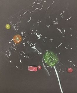
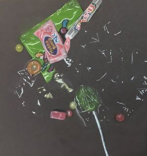
Candy Drawing
|
|
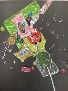
|
I assumed the chalk pastels would be like working with prisma pencils, but they were very different. The chalk was easily smudged, so I had to make a conscious effort to keep my drawing neat. Both prismas and chalk are great for blending though, which was helpful when I had to make the gold colors of the Snickers. From our previous units, I knew to draw out all my bold highlights first and then color the candies. I wish I could've had more time to finish the whole set up, but overall, I am satisfied with the section I finished.
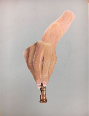
Perspective Drawings
Sketches
|
|
In Progress Photos
|
|
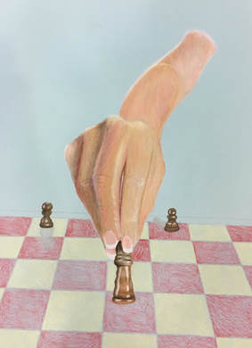
|
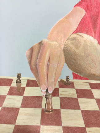
Final
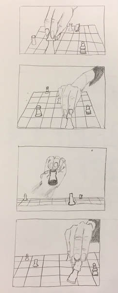
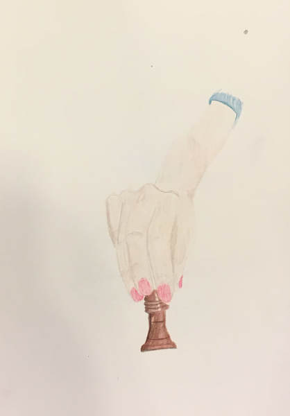
1. Describe how you created an interesting point of view? Was it successful? Why or why not?
I think my point of view was a little cliche, but I really liked how my proportions of the hand and the chess pieces turned out. You can see the closeness of the chess piece and the hand because of its size in comparison to the arm and the other chess pieces. I liked that I could add up-close details on the fingers and knuckles.
2. Why is it important to understand perspective and how to draw it?
When drawing any object or scene, you will never get a realistic angle if you don't understand perspective. Knowing which way objects are angled helps create an accurate position for the audience to envision. Without perspective, a drawing will never look like the real-life version because you're not always facing something head-on.
3. How were the colored pencil exercises important in the success of your piece?
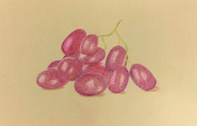
Since I had never used prismas before this class, it would have been a disaster of a piece if I hadn't practiced with the grapes, pumpkin, and vase. Doing those exercises taught me that I needed to really layer colors on top of each other to create different shades and to make the image vibrant. I also learned how to give highlights to objects, which helped me when drawing the chess pieces.
4. Describe the craftsmanship of your colored pencil. What techniques were used?
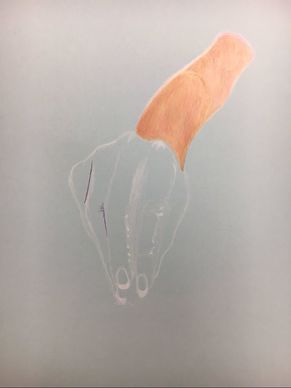
As I drew I liked to start with lighter colors and then layer on others. As you can see in my in progress photos, I added in a lot of white to create multiple highlights on the fingers and chess pieces. My blending for skin color did not work out the way I wanted to though. I started out with the light there and layered a little too much dark tones in the shadow part of the hand.
5. Were you able to achieve depth by showing a foreground, middle ground, and background?
With the chess board, I was able to create a foreground and middle ground. In the drawing, you can see the hand and the chess piece are the closest objects in the foreground. As the chess board continues on, you can see the distinction of the middle ground because of the two other chess pieces, which are much smaller in size. Lastly, in the background we have the shoulder, shirt and pillow. I wish I had more time to draw other objects in the background to give more of a variety.
6. Explain your experience with colored pencil and the project in general? What were the obstacles and advantages?
Using prisma colors is very hard for me. I don't like the layering process because I find that I usually go too light or too dark on accident. You can see in the shadowed part of my hand that it almost looks sickly because I pushed the gray too hard. In the upper part of the arm, the skin tone looks a little too pale. It was really hard for me to find a combination of colors that matched the skin color in my photograph. I really liked how my chess pieces turned out though. They had the right amount of highlights and shadows that gave them the glossy look I was going for. Overall, I struggled a lot with colored pencils and the skin tone.
7. Looking back on the progression of this project what skills, techniques, or other information would you like to have been taught? Do you feel you were prepared for this project?
In class we had numerous activities to practice the blending qualities and techniques of prismas. I'm really glad we did because even though my final piece wasn't phenomenal, I could tell a difference from the first time I picked up a colored pencil. I was prepared as far as the teaching went, but I just think that colored pencils are not my favorite medium. In class I learned to shade with colors other than black, and to add in colors that you don't see for emphasis. I learned how to blend, and when to stop trying to layer on with color. I feel I was prepared for this project completely, but I personally did not do as well as others did.
I think my point of view was a little cliche, but I really liked how my proportions of the hand and the chess pieces turned out. You can see the closeness of the chess piece and the hand because of its size in comparison to the arm and the other chess pieces. I liked that I could add up-close details on the fingers and knuckles.
2. Why is it important to understand perspective and how to draw it?
When drawing any object or scene, you will never get a realistic angle if you don't understand perspective. Knowing which way objects are angled helps create an accurate position for the audience to envision. Without perspective, a drawing will never look like the real-life version because you're not always facing something head-on.
3. How were the colored pencil exercises important in the success of your piece?
Since I had never used prismas before this class, it would have been a disaster of a piece if I hadn't practiced with the grapes, pumpkin, and vase. Doing those exercises taught me that I needed to really layer colors on top of each other to create different shades and to make the image vibrant. I also learned how to give highlights to objects, which helped me when drawing the chess pieces.
4. Describe the craftsmanship of your colored pencil. What techniques were used?
As I drew I liked to start with lighter colors and then layer on others. As you can see in my in progress photos, I added in a lot of white to create multiple highlights on the fingers and chess pieces. My blending for skin color did not work out the way I wanted to though. I started out with the light there and layered a little too much dark tones in the shadow part of the hand.
5. Were you able to achieve depth by showing a foreground, middle ground, and background?
With the chess board, I was able to create a foreground and middle ground. In the drawing, you can see the hand and the chess piece are the closest objects in the foreground. As the chess board continues on, you can see the distinction of the middle ground because of the two other chess pieces, which are much smaller in size. Lastly, in the background we have the shoulder, shirt and pillow. I wish I had more time to draw other objects in the background to give more of a variety.
6. Explain your experience with colored pencil and the project in general? What were the obstacles and advantages?
Using prisma colors is very hard for me. I don't like the layering process because I find that I usually go too light or too dark on accident. You can see in the shadowed part of my hand that it almost looks sickly because I pushed the gray too hard. In the upper part of the arm, the skin tone looks a little too pale. It was really hard for me to find a combination of colors that matched the skin color in my photograph. I really liked how my chess pieces turned out though. They had the right amount of highlights and shadows that gave them the glossy look I was going for. Overall, I struggled a lot with colored pencils and the skin tone.
7. Looking back on the progression of this project what skills, techniques, or other information would you like to have been taught? Do you feel you were prepared for this project?
In class we had numerous activities to practice the blending qualities and techniques of prismas. I'm really glad we did because even though my final piece wasn't phenomenal, I could tell a difference from the first time I picked up a colored pencil. I was prepared as far as the teaching went, but I just think that colored pencils are not my favorite medium. In class I learned to shade with colors other than black, and to add in colors that you don't see for emphasis. I learned how to blend, and when to stop trying to layer on with color. I feel I was prepared for this project completely, but I personally did not do as well as others did.
Prisma
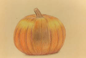
|
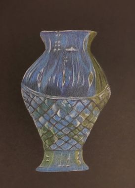
|
Working with prisma colored pencils was very hard for me. We learned how to blend and layer different colors in class by drawing a pumpkin, grapes, and a vase. I have a light touch when it comes to my art, so my prisma drawings took such a long time to finish. I had to continue layering over and over again which was time consuming and sometimes frustrating. The outcome of the drawings were well blended and realistic though.
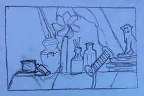
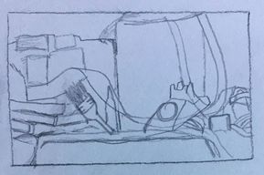
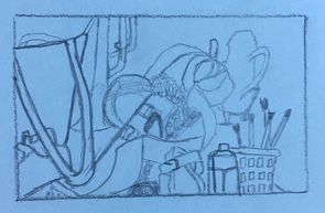
Still Life Drawings
Compositional Sketches
|
|
|
To begin the project, we had to first decide which section of the still life we wanted to tackle. I drew three easy sketches of different areas to get a feel for which would be the best to draw. I chose the first option because of its reflective qualities on the glass bottles and tea pot. I wanted to practice my shading with these objects.
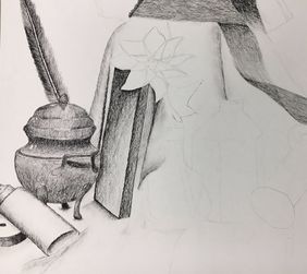
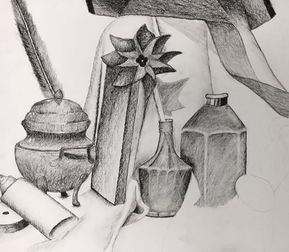
Final (in progress photos)
|
|
|
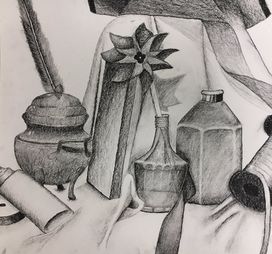
1. Describe the craftsmanship of your drawing. (Is it clear, clean edges, blended well, smudges, defined space, etc.)
Throughout my drawing I used a charcoal pencil, which when barely touched can smudge. Because my hand was constantly on the paper, I had tons of smudges that I decided to use towards the composure of my piece. The fabric has a lot of smudges to show shadows and smooth texture. I also used my charcoal pencil to darken and define the edges of my objects. My pin wheel has very dark edges to define where the wooden board ends and where the pin wheel begins.
2. Are your values and shadows realistic? How many values did you include? How and why are values important?
The shadows in my final were very accurate in comparison to the real still life. The only shadow I should've emphasized more was the pin wheel. I have a defined area on the fabric of its shadow, but I think I missed the opportunity to darken the other side of the shadow on the board. If you look at the very highlighted glue bottle and then the very dark bottom of the ribbon spool, you can see that I used a wide range of values. Values were important to my piece because they helped show the diversity in the objects. My whole still life wasn't the same color, so why would my drawing be all the same value? The exaggerated values help to really emphasize the difference between all the shapes.
3. Is there a clear source of lighting?
The highlights and the shadows I included all match up to show a consistent light source. The light was shining down at two angles, one from the top left and one that was almost straight above the objects. The first light created shadows like the one on the wooden board from the feather (hence the dark spot) and the other created darker spots almost directly underneath/behind objects like the pin wheel shadow.
4. How important were the compositional sketches? Explain.
I'm really glad I did the compositional sketches because if I hadn't, I probably would've had the wrong proportions in my final piece. They were very important in helping me decide how many objects I could handle in one drawing. My last two sketches seemed way too busy for a project that would only last a week, and if I hadn't sketched all the different areas out, I could've easily overwhelmed myself.
5. How is your final drawing successful?
I think I was successful in practicing my shading techniques as well as highlighting the right areas. The glass bottles have the right reflective highlights and my tea pot has the right shadows to give it a very realistic look. I also like how my fabric turned out. They don't just look like lines on the table, but actual textured folds. Overall, the shading and the highlighting I've done was a success in giving my still-life dimension.
6. Are the proportions, structure, and perspective of the subject correct?
As I drew my final piece, I made an effort to not use my phone's picture too much for reference. I tried to actually look at the still-life in front of me to ensure that my drawings looked as real as possible. The set up of my still life is pretty accurate in what objects are in front of each other and how big everything is. The only object I would say is a little off is the pin wheel. I should've made the pin wheel a little bit larger because looking back, I see that it was almost the same size as the glass bottle next to it.
7. Does the placement & grouping of objects create a pleasing arrangement (composition)?
My composition is not too crowded, but it still has a good amount of objects in it. The negative space is present, but not overwhelming enough to make my piece boring. I think that the placement of the pin wheel helps to center the piece and that the glass bottles and the tea pot help to balance out each side. It's a very symmetrical piece in that each part of the page is pleasing to the eye and doesn't contain too much or too little.
8. Is there a center of interest and is it well located?
Each of the larger objects in my drawing (the tea pot, the pin wheel, the glass bottles) are all about the same size, so it's hard to say that there is one specific center of interest. I think the pin wheel would be considered the most noticeable feature though because of its many values and highlights. Fortunately, it's right in the center of the piece, so it easily catches the eye.
9. How well did you manage your time and resources throughout the process of creating this drawing? Do you see where you could improve in this area?
When it comes to any kind of work, I tend to move slow to make sure that everything is done correctly. I was really glad we had a whole week to do this project because I could've honestly spent just one period on something like the glue bottle. I made sure to get all the work done that I could in class because I didn't have charcoal pencils at home. If I had worked at a little faster pace though, I could've probably had time to add the labels to the glue and the second glass bottle instead of leaving them blank. Next time I'll try to do less talking and more focusing on just my art.
10. What challenges did you encounter during this project and how did you overcome them?
The most challenging part of this project was drawing the glass bottles. I had such a hard time finding the right way to highlight the glass and give it a shape. I asked Mrs. Rossi before jumping into it on how to make the glass look like glass and she told me to shade out the bottle and then afterwards take an eraser to create highlights. This was great advice because I would've tried to draw in highlights instead of erasing them for a smoother look. I also had to be careful on where I drew the darker shadows on the bottles to ensure that it didn't look too dark to be glass.
11. What have you learned drawing a still life?
I learned a lot about bringing out the darker values to create a realistic piece. I've always been afraid to exaggerate my drawings in fear that they won't look accurate, but in art you have to push the dark and light values to emphasize objects. After the fabric and still life drawings, I have learned to stop drawing so lightly and to use a variety of values. I also learned how to make drawings of glass look reflective and more realistic, which is always something I've struggled with.
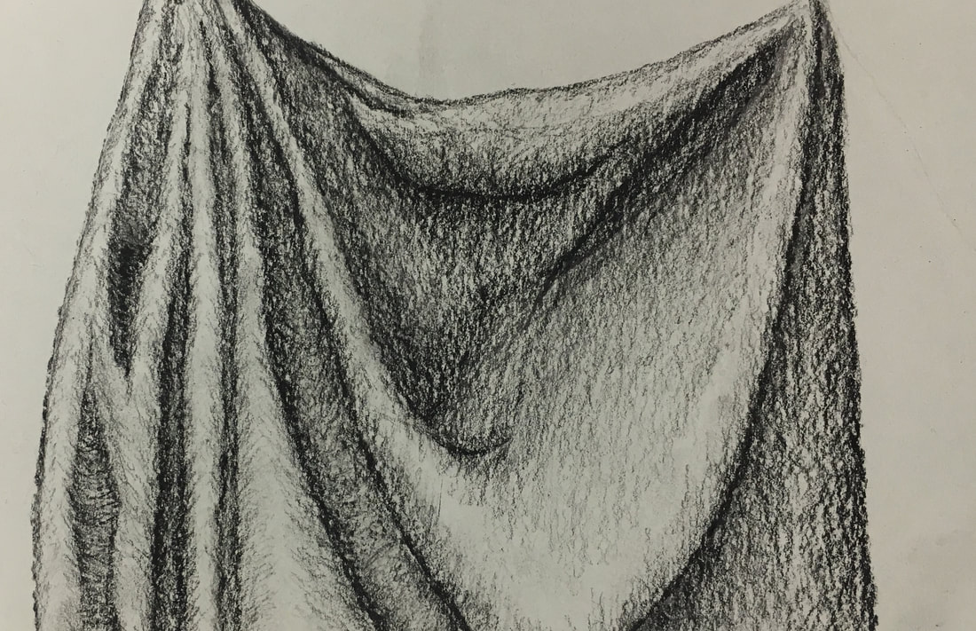
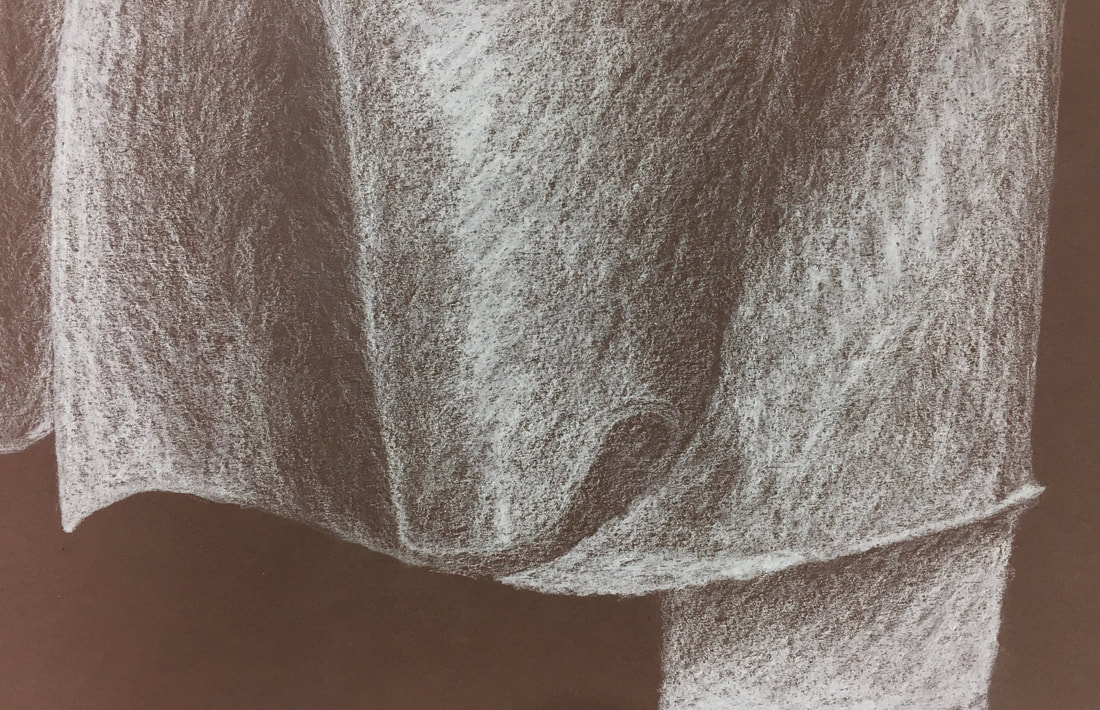
Fabric Unit
Practice
|
|
|
We started practicing drawing fabric by using three different mediums including white charcoal, graphite, and white prisma on different colored sheets. I used the white prisma on the black, the graphite on the white, and the white charcoal on the brown. We learned how to correctly shade and highlight to give the fabric a real quality.
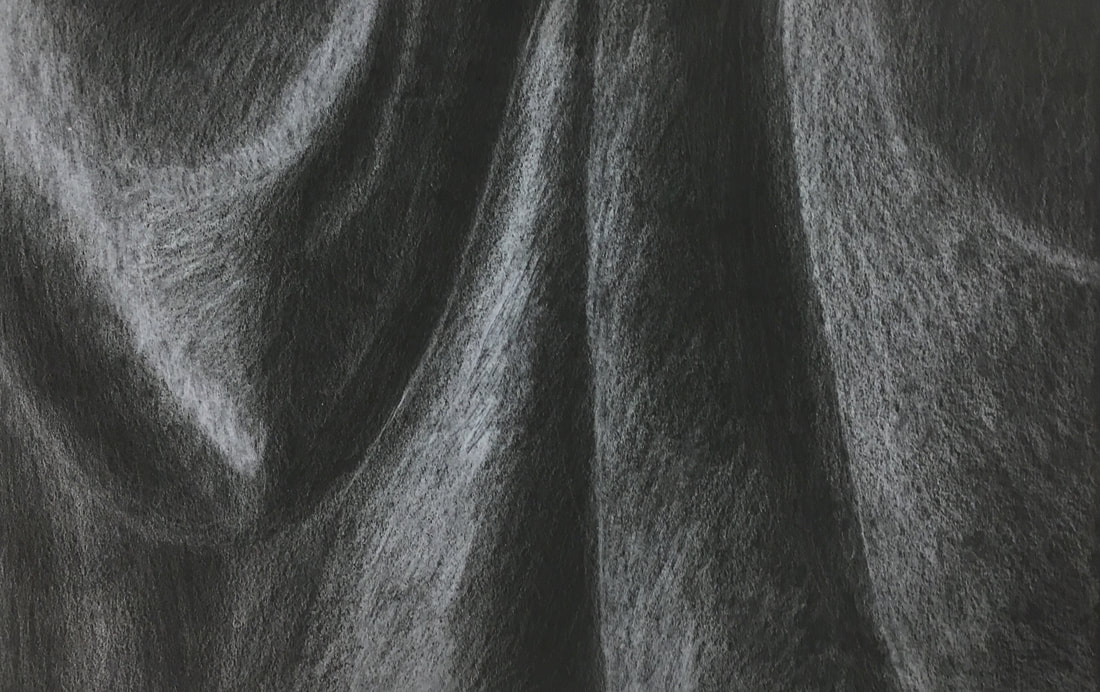
Final
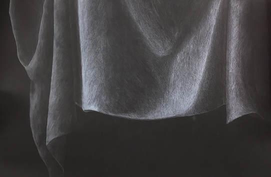
1. Did you use a wide range of values? (A range from white to black with at least 9 values). Explain how is this evident?
Throughout my piece I used multiple values to go from dark areas to light. I made sure to include the brightest white I could for some of the highlights and I left the paper black in some of the darkest shadows. Towards the middle of the curtain, you can see the fabric that had lots of light shining on it and the shadows that followed it. In these areas you can notice all the different values of white I used.
2. Explain how your knowledge and creating practice studies with value contributed to your piece.
As you can see in my practice prisma sketches, I didn't transition from light to dark values really well. The practice work helped me to understand that I needed to improve my shading abilities before the final. For example, in my practice white prisma sketch, I did not start with a light layer of white, but instead went right into heavy highlighting. In my final, I realized I needed to start with a light layer, and then slowly work on top of that to get a smooth transition between values. This helped my work to look fluid and real.
3. Describe the blending and transitions in your fabric (discuss your use of pressure with pencil/colored pencil/charcoal pencil and other techniques to achieve this).
After watching a video tutorial in class, I found that shading in circular motions really helped to blend values together for smooth transitions. As you can see, the pressure of my pencil was very light overall. I am naturally very light pressured with my work and had to constantly remind myself to press harder for areas of defined highlights.
4. Explain how your interpretation of texture is essential in capturing the look of the object.
Because the fabric we had to draw was so smooth and fluid, I had to take lots of time in shading my final project. In my practice sketches I didn't spend much time blending values and shading in uniform directions, so my fabric looked choppy. My final project took me two class periods to completely finish, but it was worth the time. Without this texture, it wouldn't have been able to capture the real look of the object.
5. If you could recreate your pieces what would you do differently to enhance the final outcome?
When I took my fabric piece home to finish it, I used my own prisma colors instead of the white prisma pencil from Mrs. Rossi's room. It might've been because it was dull, or a different brand, but the middle part of my curtain is considerably brighter than everything else. Granted, it was supposed to be very highlighted, but it still looks a little too bright. If I could recreate this piece, I would have made that middle section match with the rest of my fabric.
|
|
Ribbon Drawing
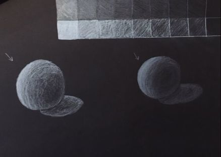
|
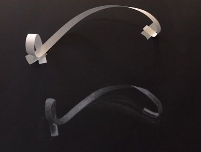
|
In these lessons, we utilized a white prisma and charcoal pencil to act as our highlights on black paper. We first sketched spheres and value charts to help us prepare for our final drawing of a twisted piece of paper, or a ribbon. Drawing the shadows was really hard on the black paper because I didn't want them to look too light in comparison to the ribbon.
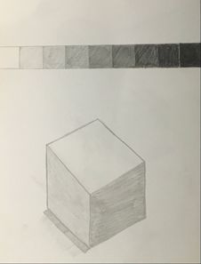
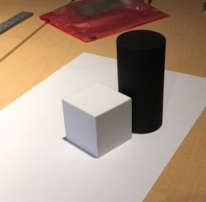
Form Value Drawings
|
|
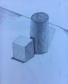
|
In this activity we learned about value and shading to make objects look more realistic. First I practiced with a value scale and a graphite pencil to draw a cube. Then for the final, we set up a cylinder and a square form on the table and had to draw all the shadows and highlights.
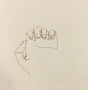
Blind Contour Hand Drawings
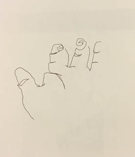
|
|
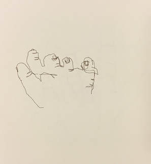
|
In this activity we practiced drawing what we saw, and not what we thought we saw. To ensure that we drew only what our eyes saw, we turned our backs to the paper and drew our hand in three positions. On top of that, we weren't supposed to lift our pen the entire time. Sketching my hand, with all its wrinkles and proportions, was extremely difficult without looking at my paper to check where I was. I drew too quickly, so my hands turned out smaller.
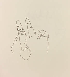
Modified Contour Hand Drawings
|
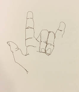
|
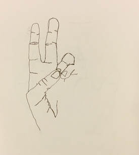
|
After doing the blind hand drawings, we moved on to an easier activity. This time we were allowed to look at our hands occasionally while drawing, but still couldn't lift our pens off the paper. This allowed me to measure and draw my hand more proportionally than before. These drawings are much more detailed and realistic. I drew a lot slower and didn't completely finish all of them.
Contour Backpack
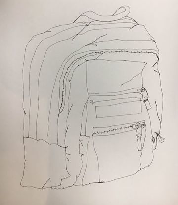
In this activity we practiced more of our fluid, contour lines by drawing a backpack without lifting our pens from the paper. Drawing every crease and fold was hard because essentially you had to retrace every line you made. I had a first sketch of the backpack, but it was too small in comparison to the real model. My final backpack (pictured) was pretty accurate in size. I'm pretty satisfied with my lines and the volume they gave.
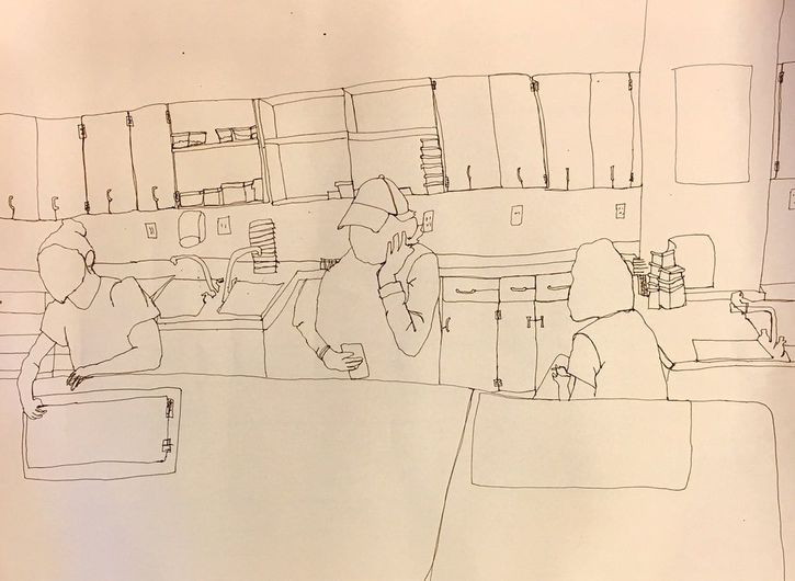
Contour Room Drawing
Practice
Final
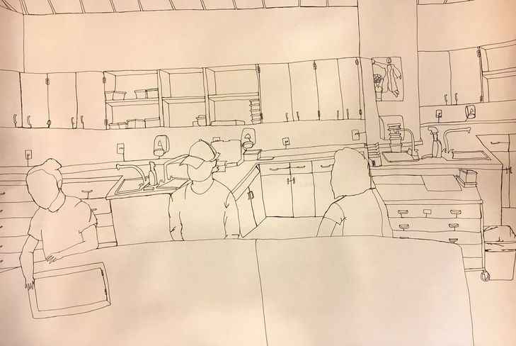
1. Did you use a fluid line? Explain how is this evident?
I used a fluid line throughout the piece, only picking up my pen when I had to pack up. My lines are smooth and in lots of places thick, showing that I had to retrace certain lines back and forth while drawing. You can also see the lines connecting the outlets and the soap dispensers to the counter because I didn't want to lift my pen.
2. Explain how your knowledge and creating practice studies with contour line contributed to the success of your piece.
The hand drawings were my first experience with contour line and if I hadn't had practiced with those sketches, I would've been very unprepared for my final. The backpack drawing helped me understand how to use lines to show texture and volume. The folds in the backpack taught me how to draw the wrinkles in the trash can and in my classmates' shirts.
3. Describe the difference in your contour line drawing to an outline drawing.
The contour line drawings I've done are much more detailed than just an outline drawing. Unlike a simple outline drawing, I had to include everything I saw, inside and outside the main outline of the room. This meant I sketched the boxes on the shelves and the objects on the counter, whereas an outline would've just had the basics.
4. Explain how your interpretation of line is essential in capturing the look of the room.
Throughout my final work I used different kinds of lines to capture the real look of the classroom. Freehanding the straight lines to create the cabinets was probably the hardest part for me because as you can see in my practice sketch, I'm not good at drawing straight lines. My lines on shirts and on the trash can helped to show a wrinkled texture. Also, by angling certain lines on the shelves and counters, you got a realistic sense of depth.
5. What did you learn from completing this drawing? If you could recreate your piece what would you do differently to enhance the final outcome?
Completing this project was really challenging for me because I'm a perfectionist. Allowing the lines to be raw and imperfect was hard for me to do. Many times I wanted to lift my pen and go back over something, but I had to learn to ignore that urge. If I could recreate my piece I would pay more attention to the depth of things. On the right side of my drawing you can notice that my counter looks pushed back too far in comparison to the rest of the picture. I also would've been more patient in drawing the figures of my classmates because I messed up a little bit on the arm and shirt of one of them.
 RSS Feed
